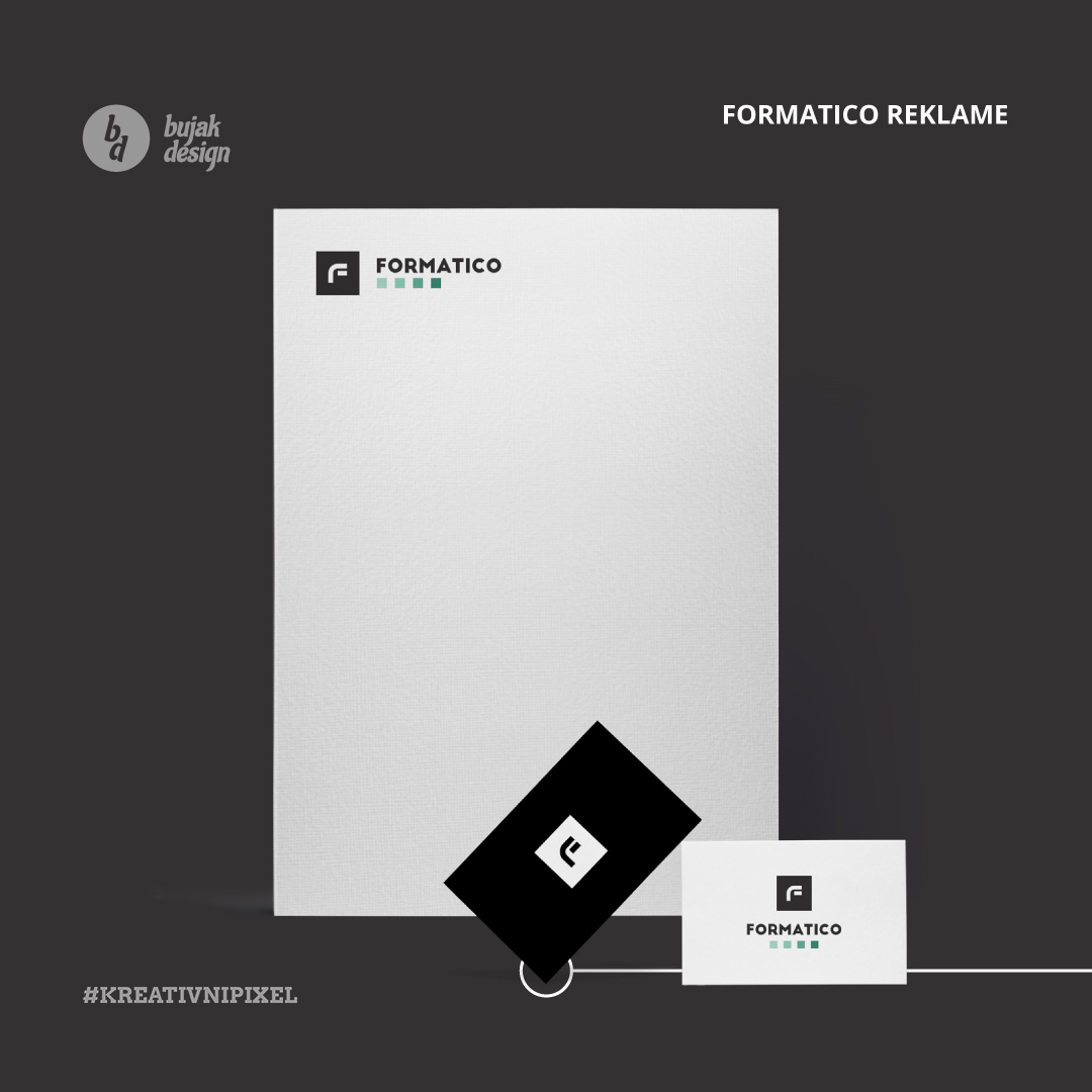
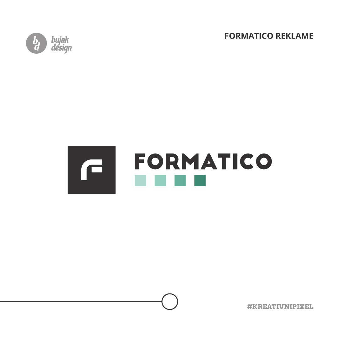
So how did Formatico Branding come to pass?
I met the CEO of this small company while working in a corporation/company with over 350 employees. We went to meetings, and we worked on many different tasks, I as a representative and he as a contractor. It was quite a journey for us, leading to many more projects. We developed a friendship, and afterward, his company became one of Bujak Design most important clients.
Deliverables
- Logo Design
- Brand Guidelines Document
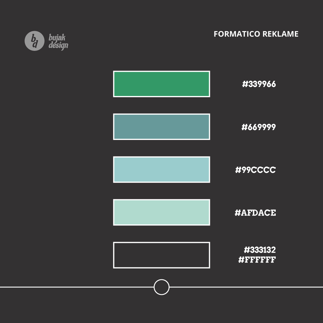
- Colors
- Typography
Color & material
For colors, I have used dark green and dark grey variants to empower the brand. Formatico Reklame is a small company for design consulting and sign making. The logo has the letter “F” as the main symbol inside the rectangle shape and the colors work well with the typography.
Dark Green
#339966
White
#ffffff
Dark Grey
#333132
Typography and Fonts for Formatico
For typography, I have used Google Font called “Poppins.” It fits well into the theme of design consulting and sign-making.
For the primary text of the logo, we used the font: “Big John”.
We use Poppins Bold for titles. And we use Poppins Regular for all other standard forms of text, from applications on print, web design, brochures, and other resources communications.
What We Delivered
The logo is a mixture of 3 symbols: the letter “F,” the equal sign, and curved lines. Each of them has its place. The letter “F” is used because it is the first letter of the name “Formatico Reklame.”
The equal sign is there because of the company “Formatico Reklame” delivers the same high quality to all its client’s services.
And the “curved line” element is there because this company never does not stand still and is always on the move to create something new. Together they symbolize energy, focus, and constant movement.


