I previously mentioned that all good stories start with a good friendship.
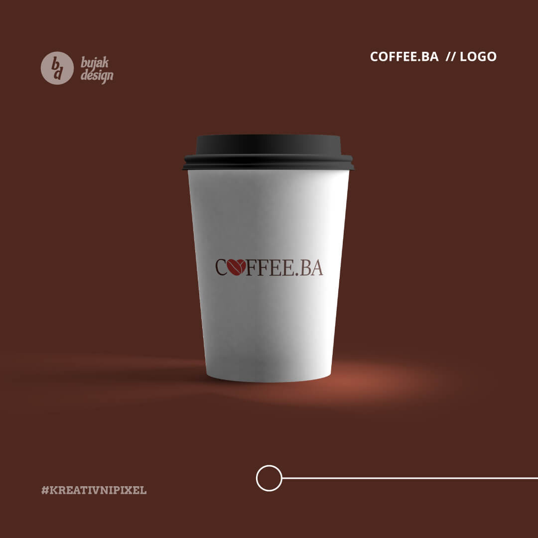
Well, now the friendship has become a permanent partnership. My school classmate Dejan and his company AC-DC trade d.o.o. hired Bujak Design, my company, to create a logo for his new brand called “Coffee.ba.” Coffee.ba is a coffee dispenser brand in Bosnia and Herzegovina which will have its machines all over the country.
Deliverables
- Logo Design
- Colors
- Typography
Color & material
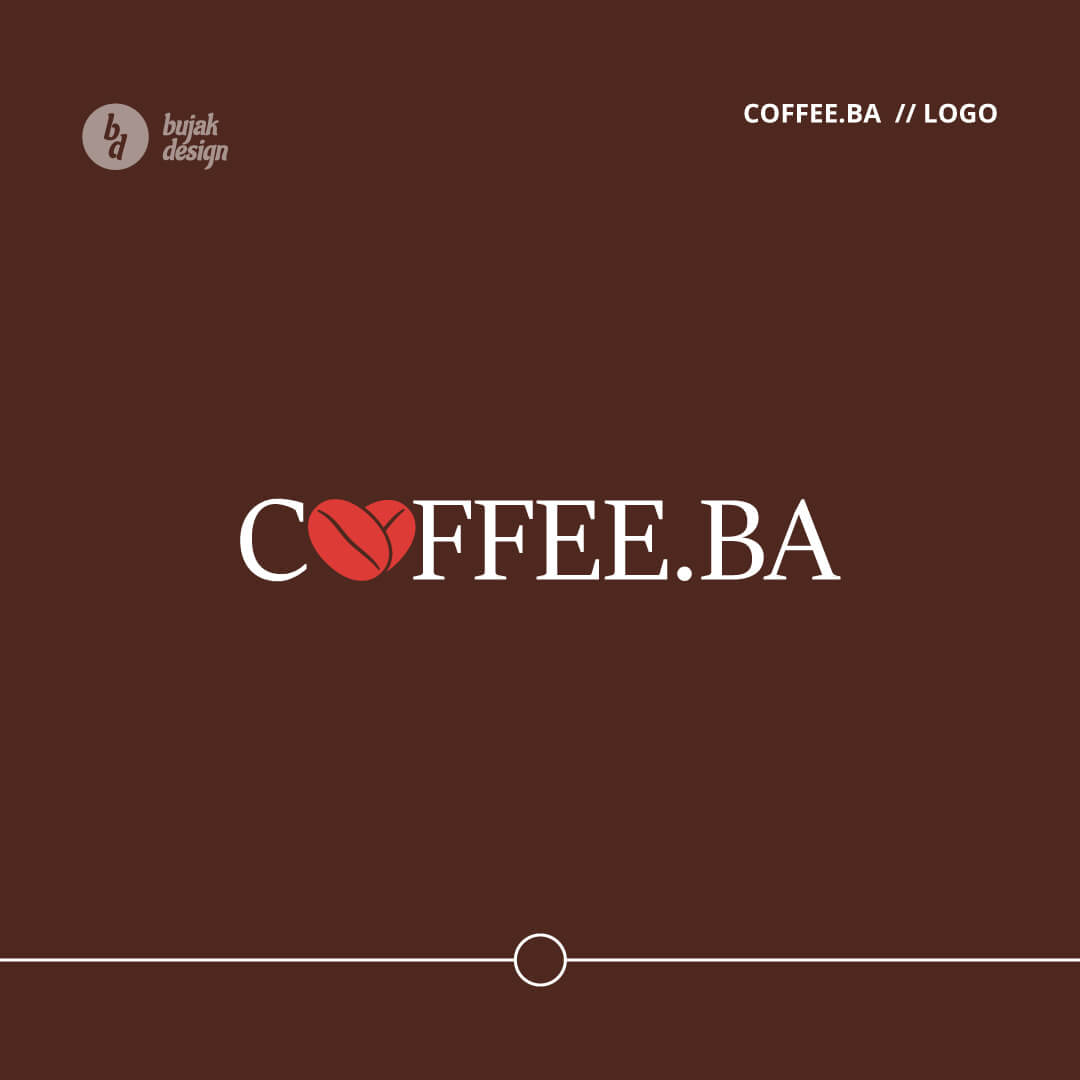
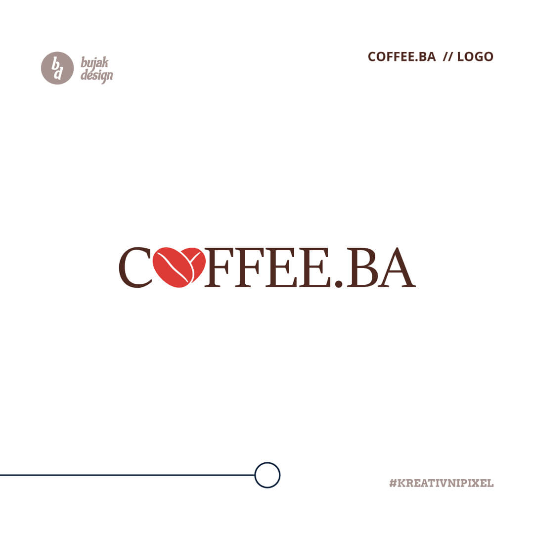
I have used dark brown and bright red variants for colors to make the brand stand out. Coffee.ba is a brand for coffee dispensers all over Bosnia and Herzegovina. The logo has the heart symbol made out of 2 coffee beans as the main symbol. It is put instead of the letter “O” without compromising the legibility of the text, and people can read the logo “Coffee.ba” clearly.
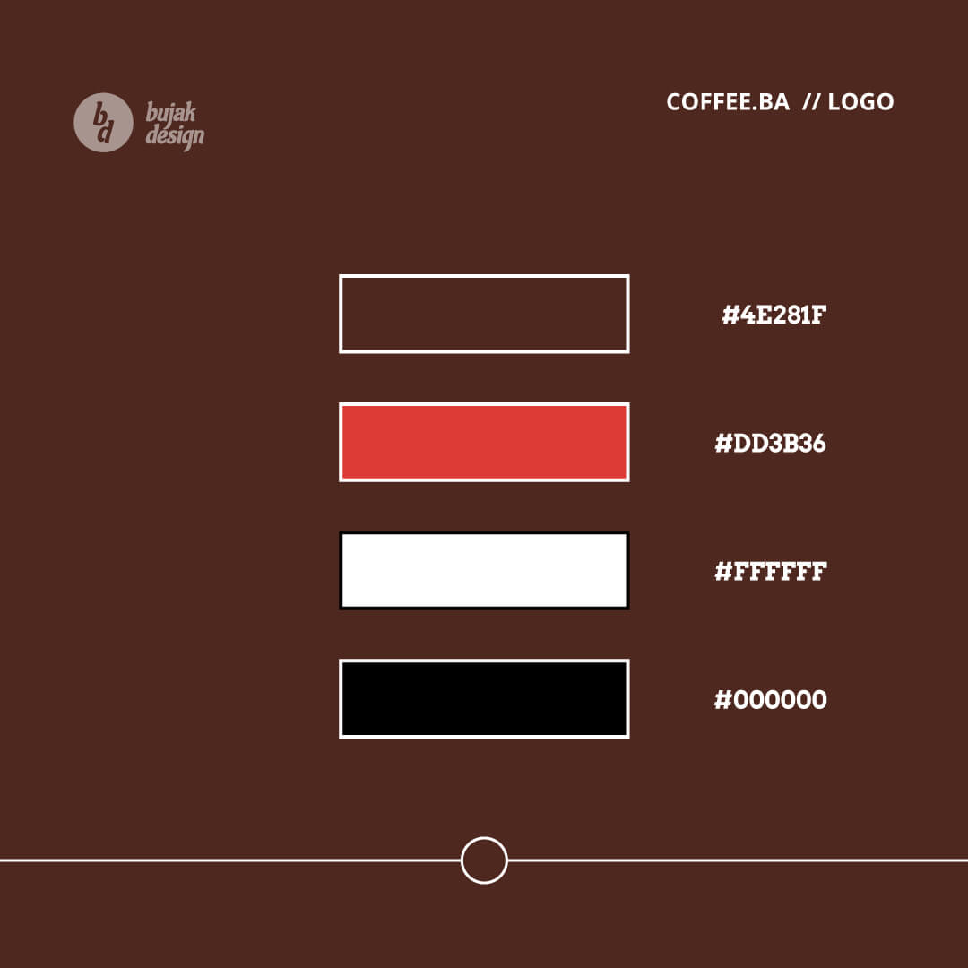
Coffee Brown
#4e281f
Coffee Red
#dd3b36
Black
#000000
White
#ffffff
Typography and Fonts for Coffee.ba Logo
For typography, I have used a Microsoft Font called “Sitka.” It fits well into the theme of coffee drinking and has a bit of a retro, serif feel.
For the primary text of the logo, we used the font: “Sitka Banner.”
We use “Sitka Banner Bold” for titles. And we use “Sitka Text” for all other standard forms of text, from applications on print, web design, brochures, and other resources communications.
What We Delivered
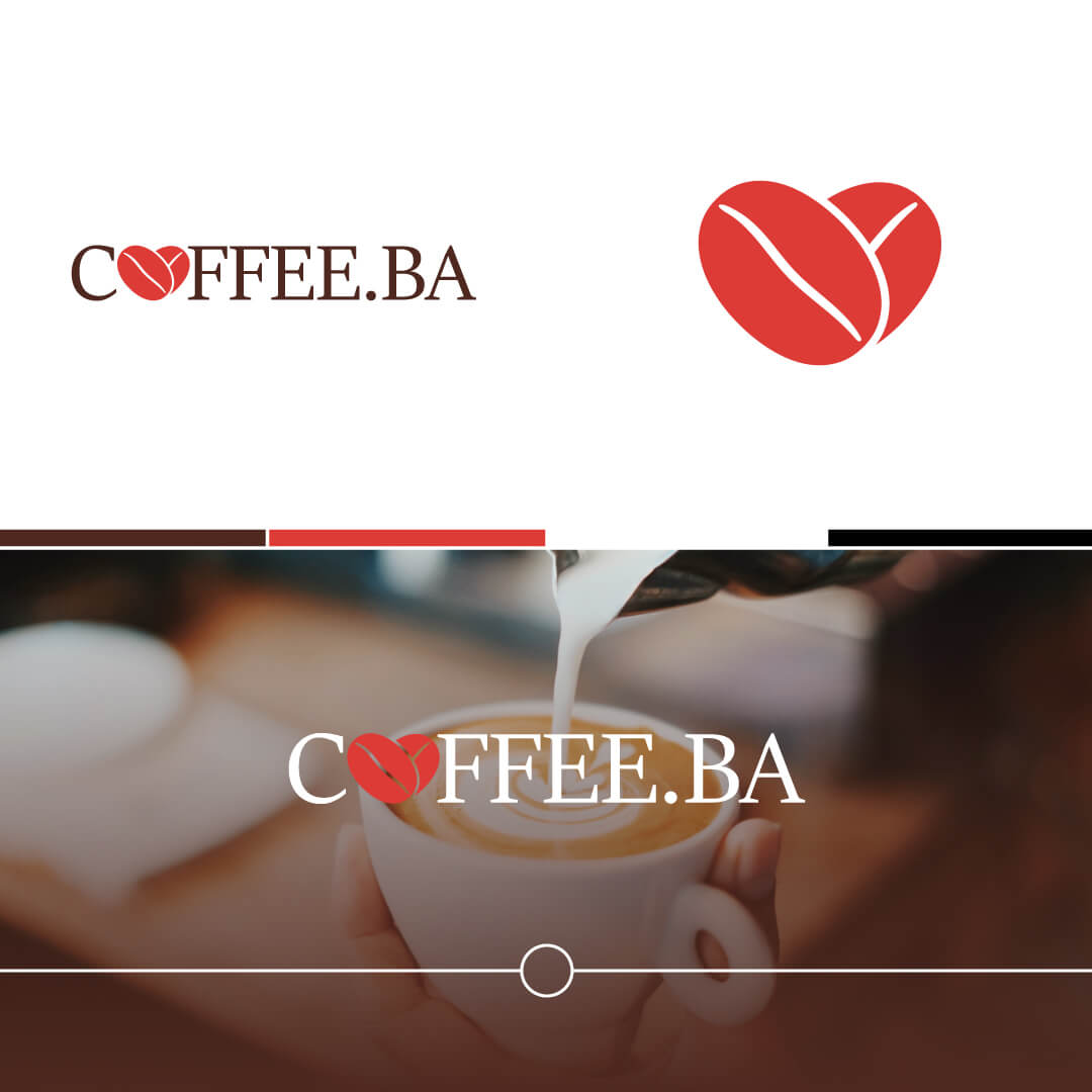
The logo icon is a mixture of 2 symbols: the heart symbol, made out of 2 coffee beans intertwined. That logo icon is used instead of the letter “O” in the word “Coffee.ba”, ensuring that the legibility of the text is not compromised.
The logo has 2 variants: the icon only and the whole title for the “Coffee.ba” logo. Together they symbolize enjoyment of coffee, love and positive vibes from drinking it.


